Posts
My thoughts and ideas
Welcome to the blog
My thoughts and ideas
Introduction to bioinformatics for RNA sequence analysis
We are going to begin our single-cell analysis by loading in the output from CellRanger. We will load in our different samples, create a Seurat object with them, and take a look at the quality of the cells.
Note, we have provided the raw data for this exercise in your cloud workspace. They are also available here.
The general steps to preprocessing your single-cell data with Seurat:
First, create a new R script and load the needed packages. The most important package for this step is Seurat. Seurat provides a unique data structure and tools for quality control, analysis, and exploration of single-cell RNA sequencing data. Seurat is very popular and is considered a standard tool for single-cell RNA analysis. Another example of a toolkit with similar functionality is Scanpy, which is implemented in Python.
library("Seurat")
library("ggplot2") # creating plots
library("cowplot") # add-on to ggplot, we use the plot_grid function to put multiple violin plots in one image file
library("dplyr")   # a set of functions for data frame manipulation -- a core package of Tidyverse (THE R data manipulation package)
library("Matrix")  # a set of functions for operating on matrices
library("viridis") # color maps for graphs that are more readable than default colors
library("gprofiler2")
Let’s make sure our workspace is configured the way we like. We will set our working directory where files will be saved. It is always good practice to verify what directory you are in and to ensure that you set the directory to where you want your files to be saved.
getwd()                         # list your current working directory
dir()                           # list the contents of your current working directory
setwd("/cloud/project/")        # set your working directory to where your data files are located
getwd()                         # verify that your working directory has been set correctly

outdir="/cloud/project/outdir_single_cell_rna" # a path to where you want your plots to be saved
dir.create(outdir)
We already have our single-cell data files loaded into the posit session. Let’s take a look at them:
list.files("data/single_cell_rna/cellranger_outputs") # use this command or navigate to the file in the finder pane
You should see six h5 files:
[1] "Rep1_ICB-sample_filtered_feature_bc_matrix.h5"   "Rep1_ICBdT-sample_filtered_feature_bc_matrix.h5"
[3] "Rep3_ICB-sample_filtered_feature_bc_matrix.h5"   "Rep3_ICBdT-sample_filtered_feature_bc_matrix.h5"
[5] "Rep5_ICB-sample_filtered_feature_bc_matrix.h5"   "Rep5_ICBdT-sample_filtered_feature_bc_matrix.h5"
Next, we will read in our data matrix generated by Cell Ranger. Cell Ranger provides several output files, but the one we need is sample_filtered_feature_bc_matrix.h5, which is a matrix of the raw read counts for all cells per sample. This file is not human-readable but can be mentally visualized as a table where the cell barcodes are the column headers and the genes (or features) are the row names.
We will be using 3 replicates, which are separated into pairs of ICB-treated and CD4 depleted ICB-treated samples.
The CreateSeuratObject function is given 4 parameters. The first is the counts, which we supply with the data read in from the h5 files. The project parameter is basically what you want this Seurat object’s identification to be, so we pass it the sample name. We also apply a little bit of filtering in this step by saying that we only want to create an object where each gene is found in a minimum of 10 cells and each cell has a minimum of 100 features (genes).
For example, two samples could be processed like this:
Rep1_ICBdT_data = Read10X_h5("data/single_cell_rna/cellranger_outputs/Rep1_ICBdT-sample_filtered_feature_bc_matrix.h5") # read in the cellranger h5 file

Rep1_ICB_data = Read10X_h5("data/single_cell_rna/cellranger_outputs/Rep1_ICB-sample_filtered_feature_bc_matrix.h5")

Rep1_ICBdT_data_seurat_obj = CreateSeuratObject(counts = Rep1_ICBdT_data, project = "Rep1_ICBdT", min.cells = 10, min.features = 100)

Rep1_ICB_data_seurat_obj = CreateSeuratObject(counts = Rep1_ICB_data, project = "Rep1_ICB", min.cells = 10, min.features = 100)
The h5 file is realitvely new, to read in the matrix.mtx, genes.tsv (or features.tsv), and barcodes.tsv use the Read_10X function.
data <- Read10X(data.dir = "data/single_cell_rna/cellranger_outputs/")
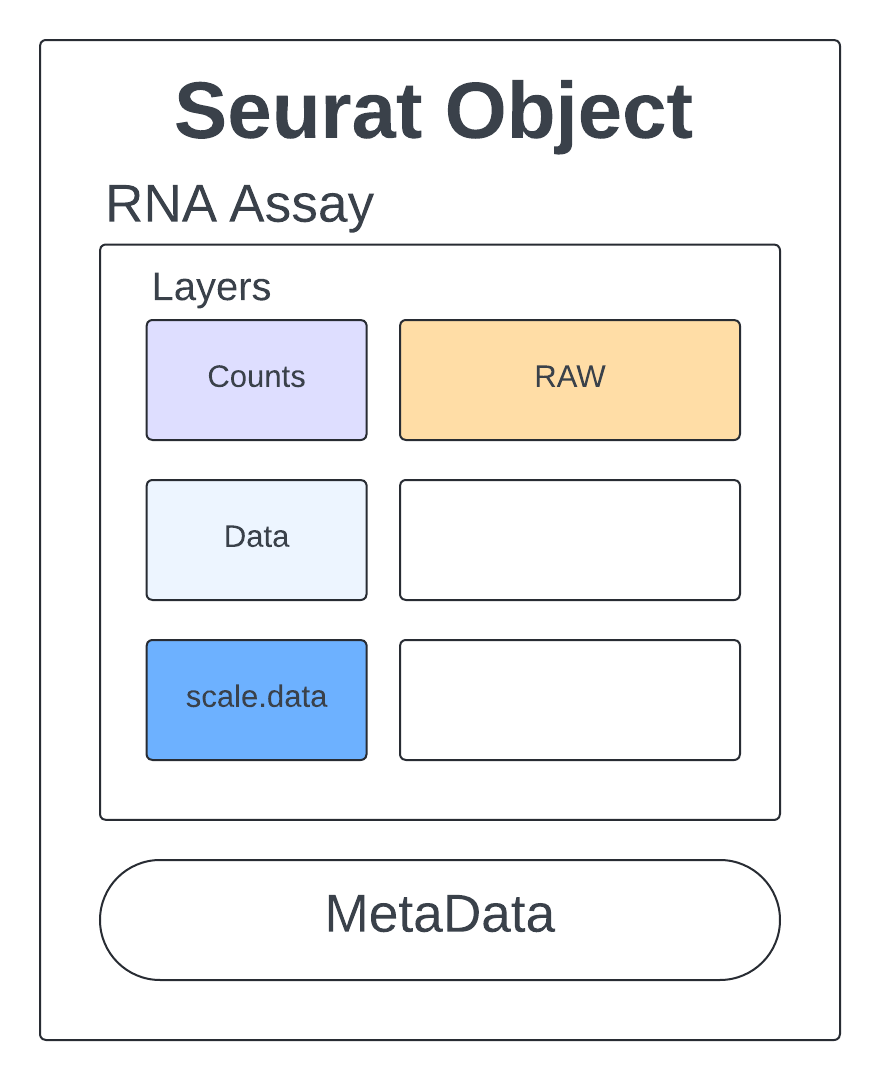
Let’s get a feel for what this Seurat object looks like and how we can access the information we will use for quality assessment, clustering, and further analysis.
print(Rep1_ICB_data_seurat_obj)
An object of class Seurat
14423 features across 4169 samples within 1 assay
Active assay: RNA (14423 features, 0 variable features)
 1 layer present: counts
We see we have 14423 features which are our genes, 4269 samples which are our cells, and 1 assay which is our counts matrix.
Assays(Rep1_ICB_data_seurat_obj) # seurat objects are made up of assays

Layers(Rep1_ICB_data_seurat_obj) # assays contain layers
The raw counts are stored in an assay called RNA.
Rep1_ICB_data_seurat_obj[["RNA"]] # an assay with layers
Assay (v5) data with 14423 features for 4169 cells
First 10 features:
 Mrpl15, Lypla1, Tcea1, Atp6v1h, Rb1cc1, 4732440D04Rik, Pcmtd1, Gm26901, Sntg1, Rrs1
Layers:
 counts
Let’s view our counts.
Rep1_ICB_data_seurat_obj[["RNA"]]$counts
14423 x 4169 sparse Matrix of class "dgCMatrix"
  [[ suppressing 59 column names ‘AAACCTGAGCGGATCA-1’, ‘AAACCTGCAAGAGGCT-1’, ‘AAACCTGCATACTCTT-1’ ... ]]
  [[ suppressing 59 column names ‘AAACCTGAGCGGATCA-1’, ‘AAACCTGCAAGAGGCT-1’, ‘AAACCTGCATACTCTT-1’ ... ]]

Mrpl15        . . . 1 . . . . . . . 1 1 . 2 . . . . . . . . 1 1 1 . . .  5 . . . 1 1 . . . 1 1 . . . . . . . . . . . . . . . 1 . . . ......
Lypla1        . . . 1 . . . . . . . . . . 1 1 . . . . . . . 2 1 . . 1 .  6 . . 1 . . . . . . 1 . . 1 . . . . . . . . . . . 1 . . . . ......
Tcea1         . . . . . . 2 . . . 1 . 1 . 1 . 2 1 1 . . . . . . . . . 1 20 . . 2 . 2 . 1 . 3 . . 1 1 . . . . 2 . 3 1 . 1 . . 3 . . 1 ......
Atp6v1h       . 1 . . . . . . . . . . 1 . . 1 . . . . . . . . 1 . 1 . .  2 . . . 2 1 . . . . . . 2 1 . 1 . . 1 2 . 1 . . . . . . . 1 ......
Rb1cc1        . . . . 2 . 1 . . . . . 3 . 1 1 . . . . . 1 . . 2 4 . . .  1 . . . 1 1 . . . 1 1 . . . . . 2 . 2 1 . 2 1 . . . . 2 1 . ......
4732440D04Rik . . . . . . . . . . . . . . . . . . . . . . . . . . . . .  1 . . . . . . . . 1 . . . . . . . . . . . 1 . . . . . . . . ......
Pcmtd1        . . . . . 1 . . . . . . . . . 1 1 . . . . 1 . . 1 . . 1 .  3 . . . . 1 . . . . . . . . 1 . 1 . . . . . . . . . . 1 1 . ......
Gm26901       . . . . . . . . . . . . . . . . . . . . . . . . . . . . .  . . . . . . . . . . . . . . . . . . . . . . . . . . . . . . ......

 ..............................
 ........suppressing 4110 columns and 14407 rows in show(); maybe adjust options(max.print=, width=)
 ..............................
The counts matrix is not very human readable and not at all human interpretable. Again, if we could see the whole matrix it would look like a table with the columns as cell barcodes and the row names as genes. The numbers are how many reads of that gene were observed in each cell.
We store our human-readable annotations in a place called meta.data. We can see that this is much more interpretable with row names as cell barcodes and columns as labels for each cell. As we analyze our data we will add a lot of columns to meta.data so get used to looking at it!
Automatically meta.data is populated with three columns:
head(Rep1_ICB_data_seurat_obj@meta.data)
                   orig.ident nCount_RNA nFeature_RNA
AAACCTGAGCGGATCA-1   Rep1_ICB       5679         1758
AAACCTGCAAGAGGCT-1   Rep1_ICB       1397          496
AAACCTGCATACTCTT-1   Rep1_ICB       8463         2444
AAACCTGCATCATCCC-1   Rep1_ICB       4640         1721
AAACCTGGTTCGGGCT-1   Rep1_ICB       3810         1291
AAACCTGTCAGTCCCT-1   Rep1_ICB       7810         2079
Note that there are actually two ways to access the meta.data information:
# viewing meta.data
head(Rep1_ICB_data_seurat_obj@meta.data)

head(Rep1_ICB_data_seurat_obj[[]])

# viewing the orig.ident column in meta.data

head(Rep1_ICB_data_seurat_obj@meta.data$orig.ident)

head(Rep1_ICB_data_seurat_obj[['orig.ident']])
We can view the cell’s identities by using the Idents function. Our cell’s identites are set to be the orig.ident column in the meta.data. When we use our table function to create a summary, we see that all cells are from the same sample, which is expected since we are just looking at one sample’s Seurat object right now.
Idents(Rep1_ICB_data_seurat_obj) # View cell identities

table(Idents(Rep1_ICB_data_seurat_obj)) # get summary table
It is very easy to add a column to meta.data. Let’s start by adding the percentage of mitochondrial genes, this will be a useful number for when we begin removing low-quality cells. We will call our column percent.mt and will use the function PercentageFeatureSet to calculate the percentage of all the counts belonging to a subset of the possible features for each cell. We will use the pattern parameter to match all genes that start with mt (the carrot ^ character means “starts with”) and specify that we want this calculation to be done on our RNA assay.
Rep1_ICB_data_seurat_obj[["percent.mt"]] =
    PercentageFeatureSet(Rep1_ICB_data_seurat_obj, pattern = "^mt-", assay = "RNA")

head(Rep1_ICB_data_seurat_obj[[]]) # check to see the column in meta.data
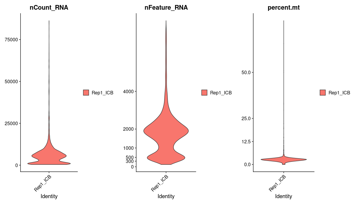
We will use percent.mt to assess the quality if our cells, lets take a quick look at this one sample data before moving on to process all our samples. Using violin plots we take a look at the number of reads, the number of genes, and the percentage of mitochondrial genes in each cell.
p1 <- VlnPlot(Rep1_ICB_data_seurat_obj, layer = "counts", features = c("nCount_RNA"), pt.size = 0)
p2 <- VlnPlot(Rep1_ICB_data_seurat_obj, layer = "counts", features = c("nFeature_RNA"), pt.size = 0) + scale_y_continuous(breaks = c(0, 300, 500, 1000, 2000, 4000))
p3 <- VlnPlot(Rep1_ICB_data_seurat_obj, layer = "counts", features = c("percent.mt"), pt.size = 0) + scale_y_continuous(breaks = c(0, 12.5, 25, 50))
p <- plot_grid(p1, p2, p3, ncol = 3)
p
We see that a majority of cells have greater than 1000 genes and a mitochondrial percentage of less 12. Cells that fall outside of this range are most likely dead or of low quality, we will want to filter these out.
Note in the above commands, we get warnings about a y-scale already being present. This is because VlnPlot defines a y-scale under the hood and we are overriding it. This warning can be safely ignored.
The above code accomplishes what we want to do just fine but it requires a lot of paths and sample names to be exactly correct for it to work. There is a lot of room for small mistakes to be made and it would take a long time to write out all the commands.
Can you write a for-loop to read in all six sample files?
Our for-loop will accomplish two major steps. The first is to read in the cellranger files and the second is to create a Seurat object. So this for-loop can be read: “For every sample in the sample_names list, paste together a path where the h5 file for that sample can be found, print that path for verification, use the function Read10X_h5 to read the h5 file, create a Seurat object using the function CreateSeuratObject, and finally add that sample’s Seurat object to a list of Seurat objects.” When the for-loop completes, our sample.data list should contain all 6 samples.
Here is how I will write the for loop:
# List of sample names
sample_names <- c("Rep1_ICBdT", "Rep1_ICB",
                  "Rep3_ICBdT", "Rep3_ICB",
                  "Rep5_ICBdT", "Rep5_ICB")

sample.data  = list() # create a list to hold the seurat object for each sample

for (sample in sample_names) {
  cat("\nWorking on sample: ", sample, "\n")
  path = paste("data/single_cell_rna/cellranger_outputs/", sample, "-sample_filtered_feature_bc_matrix.h5", sep="") # paste together a path name for the h5 file
  cat("Input file path: path: ", path, "\n") # check to make sure the path is correct

  data = Read10X_h5(path) # read in the cellranger h5 file

  seurat_obj = CreateSeuratObject(counts = data, project = sample, min.cells = 10, min.features = 100)

  sample.data[[sample]] = seurat_obj # add sample seurat object to list
}
As we did for a single sample, we want to calculate the percentage of mitochondrial genes for each cell. We will again use a for-loop to accomplish this for all samples:
for (sample in sample_names) {
  sample.data[[sample]][["percent.mt"]] =
    PercentageFeatureSet(sample.data[[sample]], pattern = "^mt-", assay = "RNA")
}
for (sample in sample_names) {
  print(table(Idents(sample.data[[sample]])))
}
Rep1_ICBdT
      4012

Rep1_ICB
    4169

Rep3_ICBdT
      5656

Rep3_ICB
    6474

Rep5_ICBdT
      6066

Rep5_ICB
    2993
We can produce violin plots to view the quality of the cells for each sample. Take time to examine the outputted plots and think about what threshold would be best to remove the low-quality cells.
for (sample in sample_names) {
  print(sample)
  jpeg(sprintf("%s/%s_unfilteredQC.jpg", outdir, sample), width = 16, height = 5, units = 'in', res = 150)
  p1 <- VlnPlot(sample.data[[sample]], features = c("nCount_RNA"), pt.size = 0)
  p2 <- VlnPlot(sample.data[[sample]], features = c("nFeature_RNA"), pt.size = 0) + scale_y_continuous(breaks = c(0, 300, 500, 1000, 2000, 4000))
  p3 <- VlnPlot(sample.data[[sample]], features = c("percent.mt"), pt.size = 0) + scale_y_continuous(breaks = c(0, 12.5, 25, 50))
  p <- plot_grid(p1, p2, p3, ncol = 3)

  print(p)
  dev.off()
}
Let’s say we decide to keep all cells with gene counts greater than 1000 and mitochondrial percentages less than 12.
We will mark cells that we want to keep. This ifelse function statement reads: if percent.mt is less than or equal to 12 we will mark it as TRUE to keep it, otherwise we will mark it as FALSE to filter it out.
Rep1_ICB_data_seurat_obj[["keep_cell_percent.mt"]] = ifelse(Rep1_ICB_data_seurat_obj[["percent.mt"]] <= 12, TRUE, FALSE)

head(Rep1_ICB_data_seurat_obj[[]])
                   orig.ident nCount_RNA nFeature_RNA percent.mt kept_cell_percent.mt
AAACCTGAGCGGATCA-1   Rep1_ICB       5679         1758   2.341962                 TRUE
AAACCTGCAAGAGGCT-1   Rep1_ICB       1397          496  50.894775                FALSE
AAACCTGCATACTCTT-1   Rep1_ICB       8463         2444   2.197802                 TRUE
AAACCTGCATCATCCC-1   Rep1_ICB       4640         1721   3.750000                 TRUE
AAACCTGGTTCGGGCT-1   Rep1_ICB       3810         1291   2.755906                 TRUE
AAACCTGTCAGTCCCT-1   Rep1_ICB       7810         2079   3.354673                 TRUE
We will do the same for the number of genes.
Rep1_ICB_data_seurat_obj[["keep_cell_nFeature"]] = ifelse(Rep1_ICB_data_seurat_obj[["nFeature_RNA"]] > 1000, TRUE, FALSE)

head(Rep1_ICB_data_seurat_obj[[]])
                   orig.ident nCount_RNA nFeature_RNA percent.mt kept_cell_percent.mt keep_cell_nFeature
AAACCTGAGCGGATCA-1   Rep1_ICB       5679         1758   2.341962                 TRUE               TRUE
AAACCTGCAAGAGGCT-1   Rep1_ICB       1397          496  50.894775                FALSE              FALSE
AAACCTGCATACTCTT-1   Rep1_ICB       8463         2444   2.197802                 TRUE               TRUE
AAACCTGCATCATCCC-1   Rep1_ICB       4640         1721   3.750000                 TRUE               TRUE
AAACCTGGTTCGGGCT-1   Rep1_ICB       3810         1291   2.755906                 TRUE               TRUE
AAACCTGTCAGTCCCT-1   Rep1_ICB       7810         2079   3.354673                 TRUE               TRUE
Create this column for all samples:
for (sample in sample_names) {
  sample.data[[sample]][["keep_cell_percent.mt"]] = ifelse(sample.data[[sample]][["percent.mt"]] <= 12, TRUE, FALSE)
  sample.data[[sample]][["keep_cell_nFeature"]] = ifelse(sample.data[[sample]][["nFeature_RNA"]] > 1000, TRUE, FALSE)

}
Let’s see how many cells we will have after filtering:
for (sample in sample_names) {
  print(sample)
  print(sum(sample.data[[sample]][["keep_cell_nFeature"]] & sample.data[[sample]][["keep_cell_percent.mt"]]))
}
[1] "Rep1_ICBdT"
[1] 3106
[1] "Rep1_ICB"
[1] 2986
[1] "Rep3_ICBdT"
[1] 5072
[1] "Rep3_ICB"
[1] 5680
[1] "Rep5_ICBdT"
[1] 4547
[1] "Rep5_ICB"
[1] 1794
Let’s use the subset function to view the spread of our data after filtering.
for (sample in sample_names) {
  print(sample)
  jpeg(sprintf("%s/%s_filteredQC.jpg", outdir, sample), width = 16, height = 5, units = 'in', res = 150)
  p1 <- VlnPlot(subset(sample.data[[sample]], nFeature_RNA > 1000 & percent.mt <= 12), features = c("nCount_RNA"), pt.size = 0)
  p2 <- VlnPlot(subset(sample.data[[sample]], nFeature_RNA > 1000 & percent.mt <= 12), features = c("nFeature_RNA"), pt.size = 0) + scale_y_continuous(breaks = c(0, 300, 500, 1000, 2000, 4000))
  p3 <- VlnPlot(subset(sample.data[[sample]], nFeature_RNA > 1000 & percent.mt <= 12), features = c("percent.mt"), pt.size = 0) + scale_y_continuous(breaks = c(0, 12.5, 25, 50))
  p <- plot_grid(p1, p2, p3, ncol = 3)

  print(p)
  dev.off()
}
Now that we have assessed the quality on a per-sample level we can merge all our samples together to create one seurat object. The merge function will accomplish this for us and add the sample name to the end of the cell barcodes in the case that there are duplicate barcodes across samples.
sample_names <- c("Rep1_ICBdT", "Rep1_ICB", "Rep3_ICBdT", "Rep3_ICB",
                  "Rep5_ICBdT", "Rep5_ICB")

merged <- merge(x = sample.data[["Rep1_ICBdT"]], y = c(sample.data[["Rep1_ICB"]], sample.data[["Rep3_ICBdT"]], sample.data[["Rep3_ICB"]], sample.data[["Rep5_ICBdT"]], sample.data[["Rep5_ICB"]]), add.cell.ids = sample_names)
Let’s now filter out merged objects with the cutoffs decided above.
unfiltered_merged <- merged # save a copy of unfiltered merge for later
merged <- subset(merged, nFeature_RNA > 1000 & percent.mt <= 12)
merged
An object of class Seurat
18187 features across 23185 samples within 1 assay
Active assay: RNA (18187 features, 0 variable features)
 6 layers present: counts.Rep1_ICBdT, counts.Rep1_ICB, counts.Rep3_ICBdT, counts.Rep3_ICB, counts.Rep5_ICBdT, counts.Rep5_ICB
As of now, the various replicates are in their own layers. They need to be merged into 1 single layer for further analysis.
merged <- JoinLayers(merged)
merged
An object of class Seurat
18187 features across 23185 samples within 1 assay
Active assay: RNA (18187 features, 0 variable features)
 1 layer present: counts
We can use Idents to verify that we have all our cells in our merged object.
Idents(merged) # View cell identities

table(Idents(merged)) # get summary table
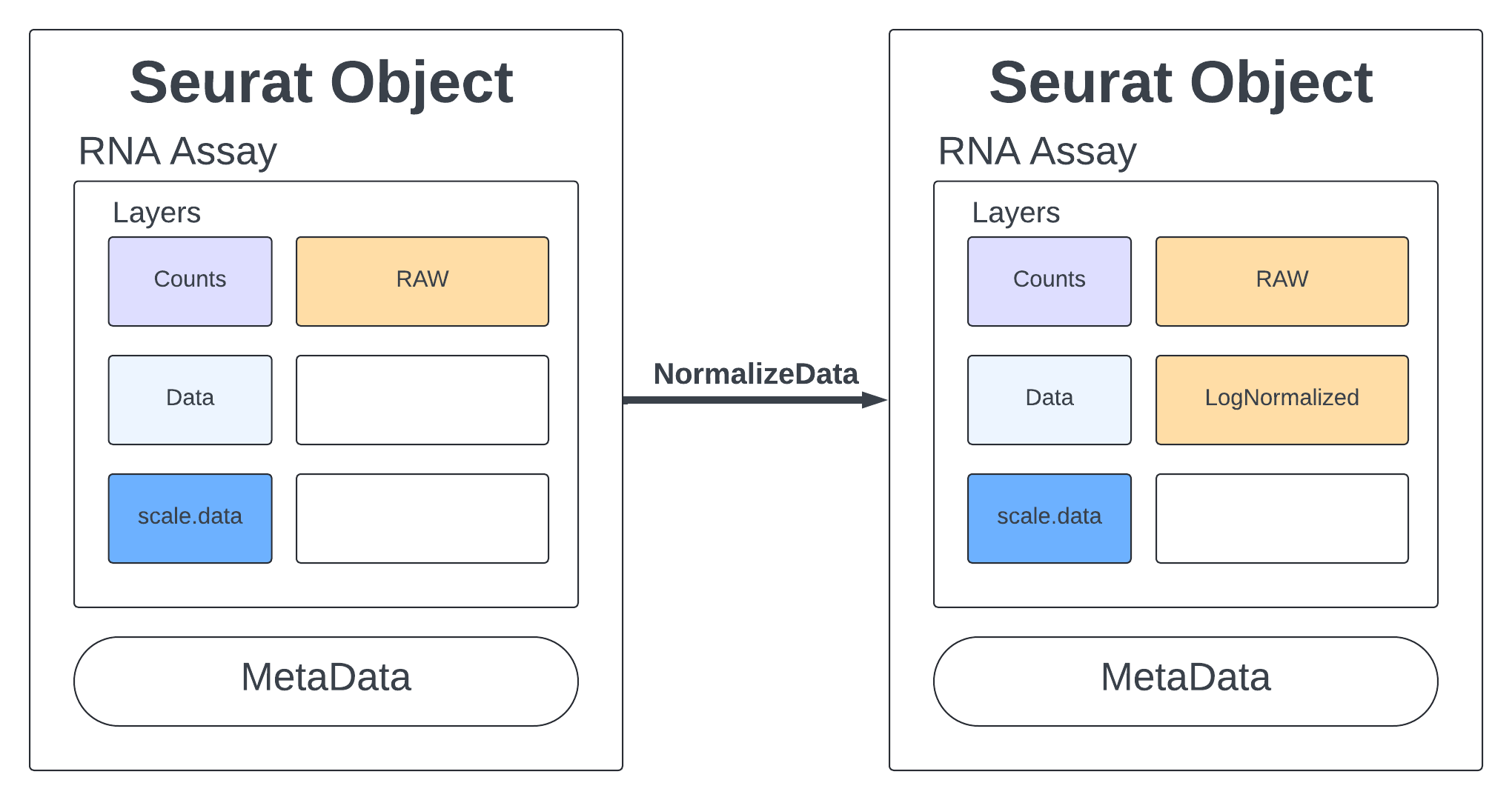
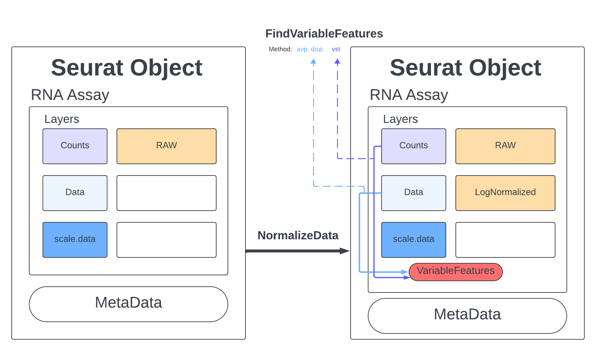
Standard practice for scRNA data is to normalize your counts. Many functions will only use the normalized counts and not look at the raw counts. The NormalizeData function takes our merged object and will log normalize our RNA assay. Log normalized in this context means that the feature counts for each cell are divided by the total counts for that cell and multiplied by the scale.factor, then natural-log transformed using log1p.
merged <- NormalizeData(merged, assay = "RNA", normalization.method = "LogNormalize", scale.factor = 10000)

merged
An object of class Seurat
18187 features across 23185 samples within 1 assay
Active assay: RNA (18187 features, 0 variable features)
 2 layers present: data, counts
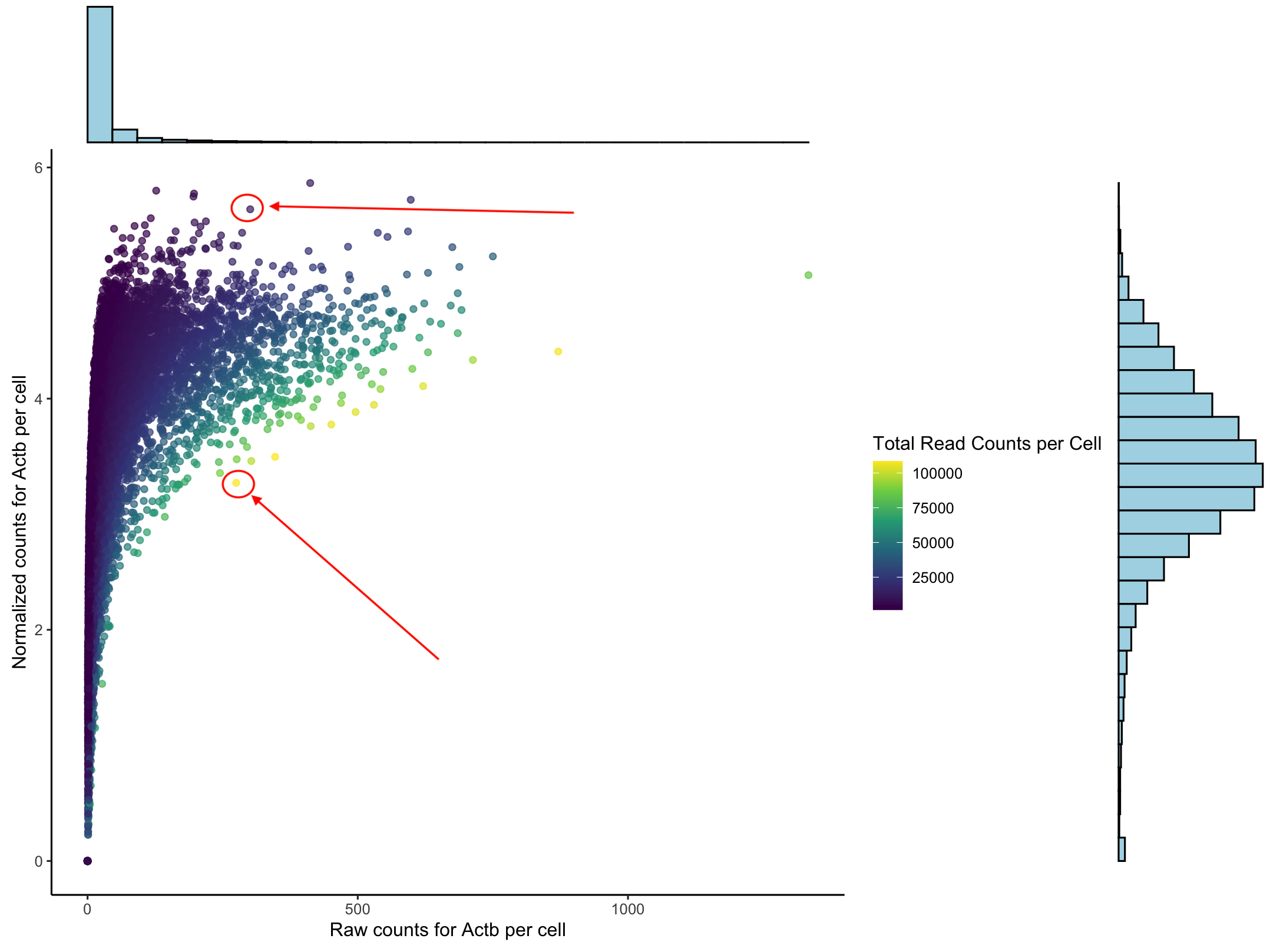
To understand what normaliziation does to our data we can look at the counts for one housekeeping gene, Actb. This plot we have the raw counts on the x-axis and the normalized counts on the y-axis. The histograms show that we do get a normal distribution and that the data follows a log curve. Each dot represents a cell. The two cells the arrows indicate have (basically) the same number of raw counts but have very different normalize counts. The color represents the total number of reads in each cell.
When we normalize we are accounting for the fact that cells are unequally sequenced. To fairly compare one cell against another we want to consider the porportion of gene expression per cell not just the total number of reads. More on this at the end.
Click here to see the code to generate this plot
library(ggExtra)

raw_counts <- GetAssayData(merged, layer = "counts")
norm_counts <- GetAssayData(merged, layer = "data")

counts_sum <- rowSums(raw_counts)

# Extract raw counts for these genes
genes_raw <- as.data.frame(as.matrix(raw_counts[c("Actb"),]))
colnames(genes_raw) <- "Actb_raw"

# Extract normalized counts for these genes
genes_norm <- as.data.frame(as.matrix(norm_counts[c("Actb"),]))
colnames(genes_norm) <- "Actb_norm"

# Combine data
genes_combined <- cbind(genes_raw, genes_norm)

total_counts_per_cell <- colSums(raw_counts)
total_counts_df <- data.frame(
  cell = names(total_counts_per_cell),
  total_counts = total_counts_per_cell
)
genes_combined$total_counts <- total_counts_df$total_counts

p <- ggplot(genes_combined, aes_string(x = "Actb_raw", y = "Actb_norm", color = "total_counts")) +
  geom_point(alpha = 0.7) +
  scale_color_viridis_c() +
  theme_classic() +
  labs(
       x = "Raw counts for Actb per cell",
       y = "Normalized counts for Actb per cell",
       color = "Total Read Counts per Cell") +
  theme(plot.title = element_text(hjust = 0.5, face = "bold", size = 10))

# Add marginal histograms for the third plot
ggMarginal(p, type = "histogram", fill = "lightblue",
           xparams = list(bins = 30),
           yparams = list(bins = 30))
The normalization adjusts for sequencing depth differences across cells. But if we also have adjust for the difference expression levels of genes. This is especially important for PCA analysis (which we will get to in just a bit).
So for each gene we perform (expression - mean(expression)) / standard_deviation(expression)). Where (expression - mean(expression)) is our centered sxpression and when we divide by the stdev we get the scalled expression. If we look at the ScaleData documentation we see there are several other ways to configure our scaling including setting varibles to regress out.
Note that if you are running out of memory for this step, you might want to run FindVariableFeatures first so that ScaleData will run on a subset of genes.
merged <- ScaleData(merged, verbose = TRUE)

merged
An object of class Seurat
18187 features across 23185 samples within 1 assay
Active assay: RNA (18187 features, 2000 variable features)
 3 layers present: data, counts, scale.data
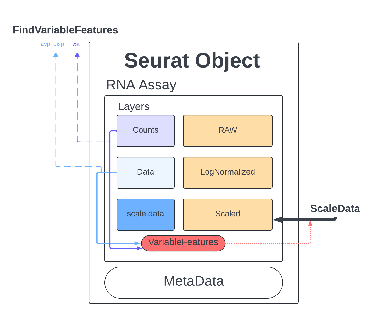
The last thing we do before we can perform PCA is identify genes that are highly expressed in some cells, and lowly expressed in others. We will use the defaults described in the documentation and the Seurat tutorial.
The method we will use to select these genes is Variance Stabilizing Transformation (vst) which is the default setting meant to account for the inherent relationship between mean expression and variance in scRNA-seq data. We set nfeatures to 2000 which is a very common setting and a good place to start, depending on the goals of our analysis this number might have to be changed later. Finally, we will perform a little filtering to make sure we aren’t cosidering genes that are too lowly/highly expressed (mean.cutoff) and makes sure we don’t have any genes that have no variability (dispersion.cutoff).
merged <- FindVariableFeatures(merged, assay = "RNA", selection.method = "vst", nfeatures = 2000, mean.cutoff = c(0.1, 8), dispersion.cutoff = c(1,Inf))
We can visualize the highly variable genes with a dot plot.
# Identify the 10 most highly variable genes
top10 <- head(VariableFeatures(merged), 10)
top10

# plot variable features with and without labels
plot1 <- VariableFeaturePlot(object=merged)
HoverLocator(plot = plot1)
Looking at the count matrix for our Seurat object is a good reminder that there is no way we can process the number of genes and cells present with just our eyes. We need a way of compressing this information into something we can more easy comprehend and manipulate. PCAs are a dimension reduction strategy that aims to show similarity without losing the patterns that drive variation. We can visualize this by picturing what it would look like if we had just two cells and a handful of genes. If one cell’s gene expression value was on the x-axis and the other on the y-axis you would get a simple dot plot and could draw two lines through those points to measure the spread of the data points in two directions. Those lines that you draw are a PC, they generalize the data points into a more manageable, single object.
If we added another cell, we would add another axis to our graph AND we would add another direction in which we could have variation. So for the 23185 cells in our dataset, we would have 23185 directions of variation or principal components (PC). The PC that deals with the largest variant is PC1. For further explanation and visuals please view this page.
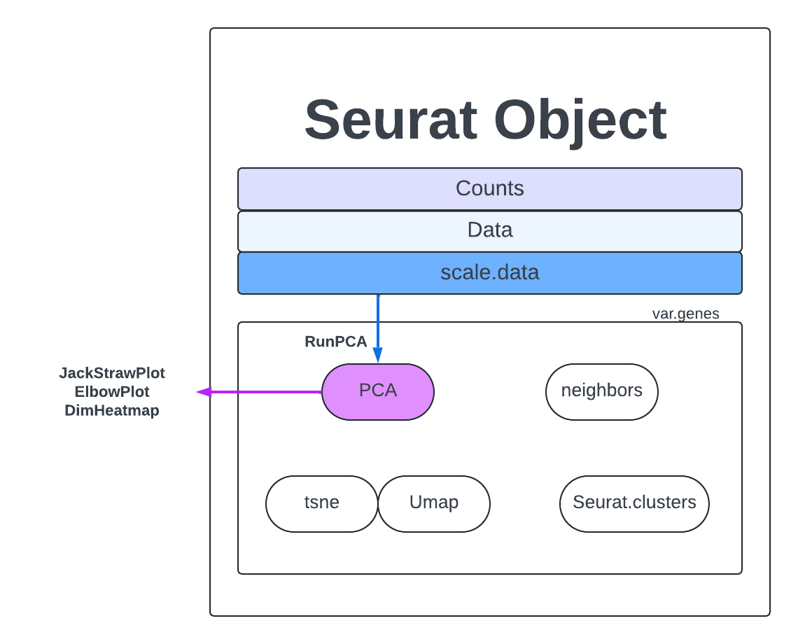
Now we will calculate PCs on our dataset. We will calculate the default 50 PCs which should capture plenty of information on this dataset.
merged <- RunPCA(merged, npcs = 50, assay = "RNA")

merged
An object of class Seurat
18187 features across 23185 samples within 1 assay
Active assay: RNA (18187 features, 2000 variable features)
 3 layers present: data, counts, scale.data
 1 dimensional reduction calculated: pca
merged[["pca"]]
A dimensional reduction object with key PC_
 Number of dimensions: 50
 Number of cells: 23185
 Projected dimensional reduction calculated:  FALSE
 Jackstraw run: FALSE
 Computed using assay: RNA
After the PCs have been calculated, then each cell is “fitted” back into that PCs context. So for each cell we ask, “whats a cell’s score/embedding for a given PC based on gene expression in that cell”?
head(Embeddings(merged, reduction = "pca")[, 1:5])
                                    PC_1        PC_2        PC_3      PC_4       PC_5
Rep1_ICBdT_AAACCTGAGCCAACAG-1   3.835173  -0.8115711   9.8921410 2.2594305 14.1203451
Rep1_ICBdT_AAACCTGAGCCTTGAT-1   3.663907  -2.2085850  -1.2447077 1.2005316 -1.6541640
Rep1_ICBdT_AAACCTGAGTACCGGA-1 -65.634614 -46.0958039  -9.3464346 7.9993856  3.6250345
Rep1_ICBdT_AAACCTGCACGGCCAT-1   4.139736  -0.8617120  -0.3006448 0.4993232 -0.6362336
Rep1_ICBdT_AAACCTGCACGGTAAG-1   3.905916  -0.3761172   1.3514115 1.0349043  3.2202961
Rep1_ICBdT_AAACCTGCATGCCACG-1 -67.302103 -45.6771707 -11.5863126 3.4400124  4.9678837
Further resources here.
Now we have to decide what are the most important PCs, which capture the most similarity and diversity without introducing too much noise. There are several methods for analyzing your PCs.
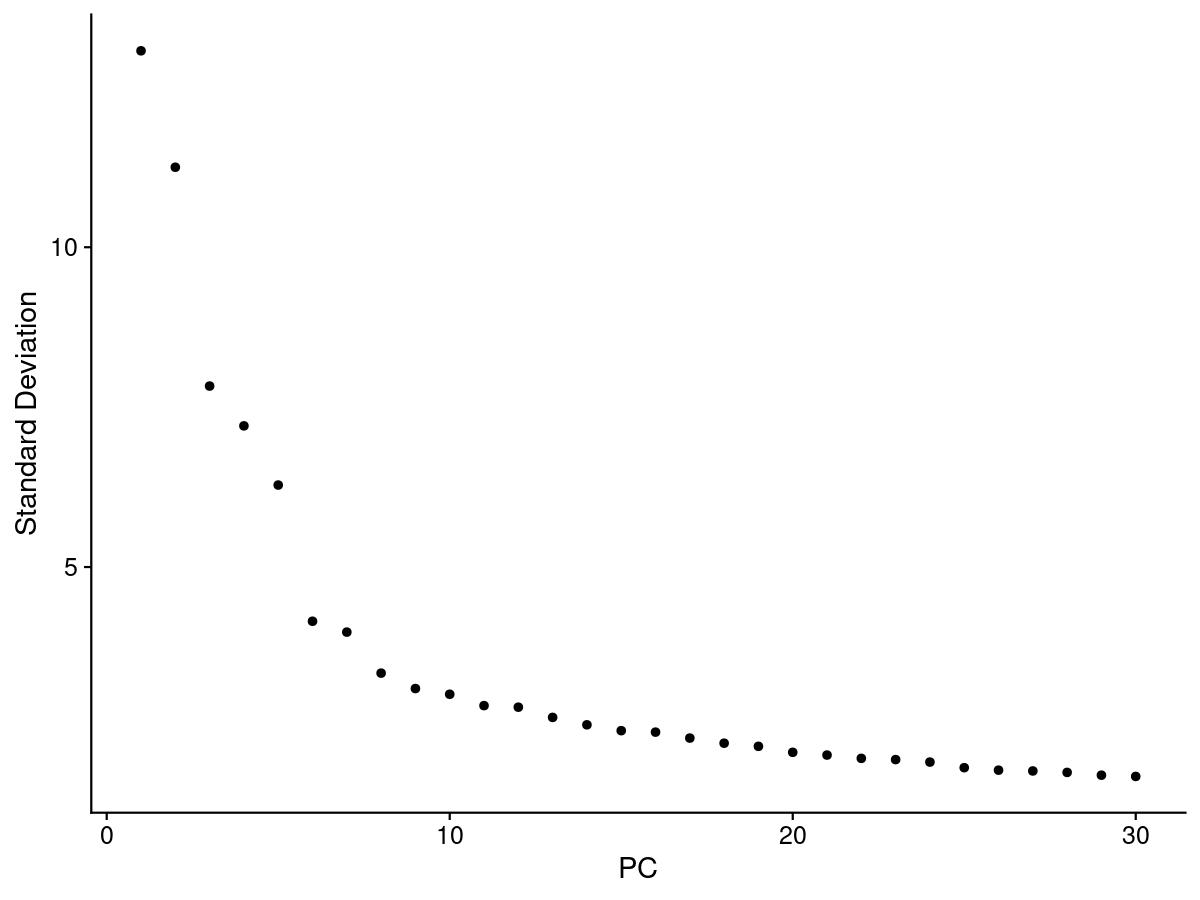
One of the most common ways to understand PCs is an elbow plot. We choose the PC that is the ‘elbow’, that is where the standard deviation stops dramatically decreasing and levels out.
elbow <- ElbowPlot(merged, ndims = 30)
jpeg(sprintf("%s/Elbow.jpg", outdir), width = 8, height = 6, units = 'in', res = 150)
print(elbow)
dev.off()
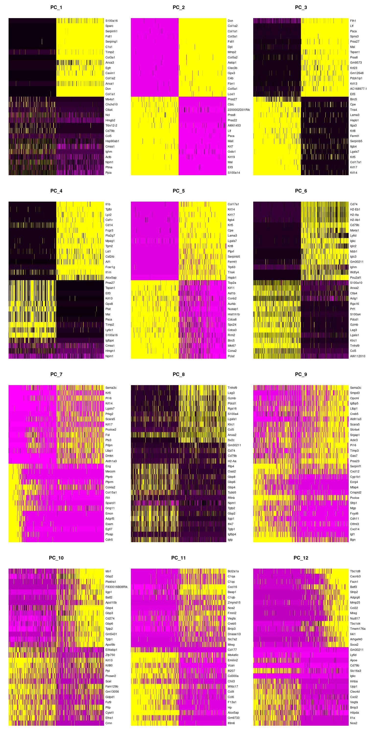
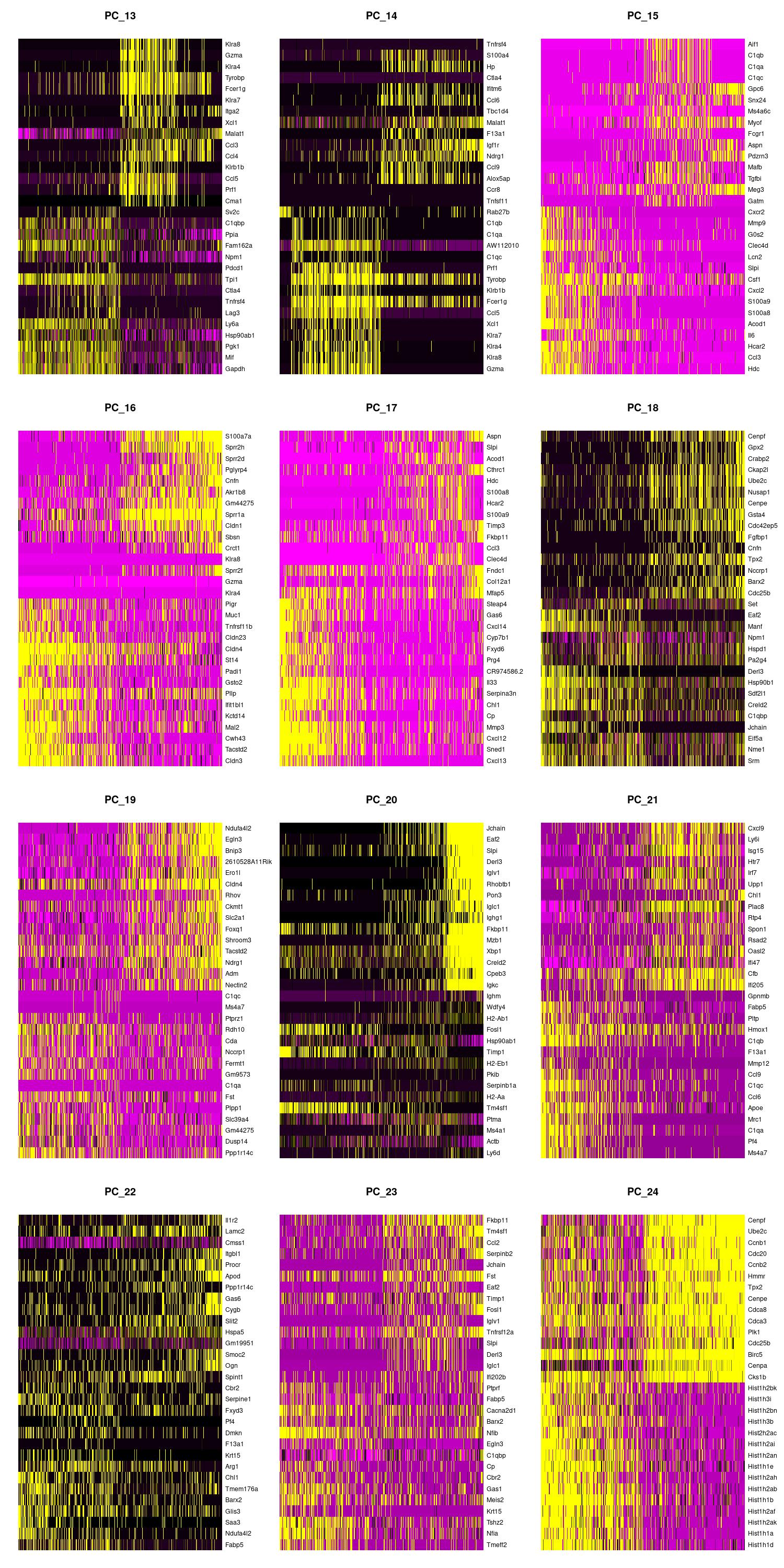
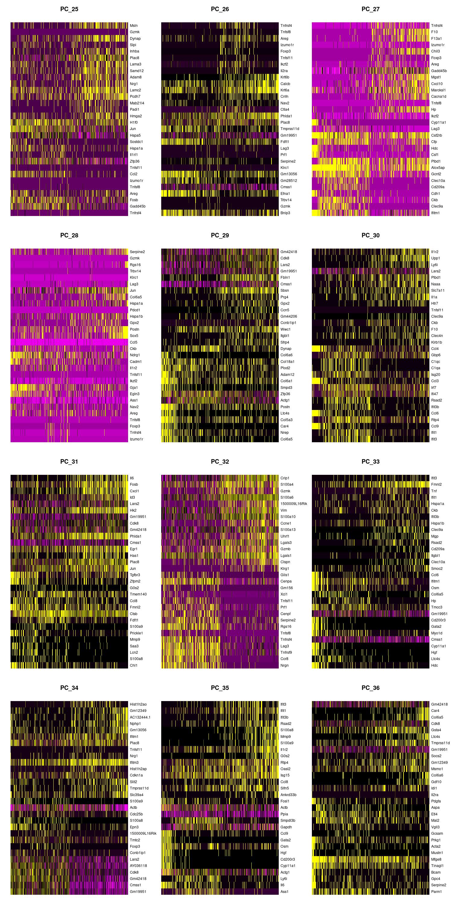
We can also view the PCs as heatmaps. We see the top genes that drive the PC and how much they are expressed or not expressed in each cell. We want our heatmaps to show contrast and not just look like a blobby mess. More importantly, we look at what genes are driving the PC, and depending on what we would like to search for in our analysis, we would want to make sure our PCs include genes that are relavent.
jpeg(sprintf("%s/DimHm1_12.jpg", outdir), width = 10, height = 20, units = 'in', res = 150)
DimHeatmap(merged, dims = 1:12, balanced = TRUE, cells = 500)
dev.off()

jpeg(sprintf("%s/DimHm13_24.jpg", outdir), width = 10, height = 20, units = 'in', res = 150)
DimHeatmap(merged, dims = 13:24, balanced = TRUE, cells = 500)
dev.off()

jpeg(sprintf("%s/DimHm25_36.jpg", outdir), width = 10, height = 20, units = 'in', res = 150)
DimHeatmap(merged, dims = 25:36, balanced = TRUE, cells = 500)
dev.off()
|
|
|
Jackstaw is an older and computationally expensive way to analyze the variability of PCs. However, it could be useful for further understanding what PCs to use. Usually, p-values over -100 are indicative of useful PCs.
# merged <- JackStraw(merged, num.replicate = 100, dims = 30)
# merged <- ScoreJackStraw(merged, dims = 1:30)

# plot <- JackStrawPlot(merged, dims = 1:30)
# jpeg(sprintf("JackStraw.jpg",), width = 8, height = 6, units = 'in', res = 150)
# print(plot)
# dev.off()
Using the elbow, heatmap, and possibly jackstraw we can make an informed decision on how many PCs we should use for cell clustering. We are trying to include as much information as possible without suffering from too much noise.
There is one tactic we can use to deduce our PC cutoff. We can see how many PCs have a standard deviation greater than 2.
ndims = length(which(merged@reductions$pca@stdev > 2)) # determines which PCs are important (stdev>2)
ndims
After looking at the elbow plot, the PC heatmaps, and JackStraw plot (this takes a long time to run, so we might want to not run it) we decided to select 22 PCs. This is a great place to play around and take your time to notice the differences that adding or removing PCs make. When in doubt, slightly more PCs is better than not enough.
We are finally on the Cell Clustering step. The first step to clustering is the FindNeighbors which computes the k.param nearest neighbors for a given dataset. The concept is that given a data point, you want to identify the closest data points to it based on some similarity metric, such as Euclidean distance or cosine similarity. This helps to identify similar points in the dataset, which can be useful for making predictions or understanding the distribution of the data.
PC = 22

merged <- FindNeighbors(merged, dims = 1:PC)
We then run FindClusters where our cells will be grouped together based on similarity. FindNeighbors focuses on finding the nearest neighbors of a single data point, while FindClusters deals with grouping multiple data points into clusters based on their similarities. More extensive explanations are found here,
merged <- FindClusters(merged, resolution = 1.2, cluster.name = 'seurat_clusters_res1.2')
Finally, we get to RunUMAP, which uses the clustering information to project our cells into a 2D space for visualization.
merged <- RunUMAP(merged, dims = 1:PC)

merged
An object of class Seurat
18187 features across 23185 samples within 1 assay
Active assay: RNA (18187 features, 2000 variable features)
 3 layers present: data, counts, scale.data
 2 dimensional reductions calculated: pca, umap
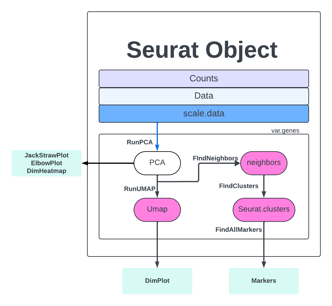
Let’s view our clusters with DimPlot.
jpeg(sprintf("%s/UMAP.jpg",outdir), width = 5, height = 4, units = 'in', res = 150)
DimPlot(merged, label = TRUE, group.by = 'seurat_clusters_res1.2')
dev.off()
Now, let’s color by our samples to make sure that no sample is clustering by itself – this would be an indication of batch effects. We want similar cells to be clustered together because they have similar gene expression. We do NOT want our cells to cluster together because of technical reasons (e.g., different sequencing batch, different replicate, etc).
# UMAP by sample
jpeg(sprintf("%s/UMAP_orig.ident.jpg",outdir), width = 5, height = 4, units = 'in', res = 150)
DimPlot(merged, label = FALSE, group.by = "orig.ident")
dev.off()
It looks like our samples are mixed nicely! We can check further by highlighting the cells from one sample.
# UMAP with one day highlighted (not saved)
highlighted_cells <- WhichCells(merged, expression = orig.ident == "Rep1_ICBdT")
DimPlot(merged, reduction = 'umap', group.by = 'orig.ident', cells.highlight = highlighted_cells)
Now it’s time to explore the nuances of clustering resolution. Choosing cluster resolution is somewhat arbitrary and affects the number of clusters called (higher resolution calls more clusters). The shape of the UMAP does not change if you change the cluster resolution. The shape of the UMAP is determined by the number of PCs used to create the UMAP.
merged <- FindClusters(merged, resolution = 0.8, cluster.name = 'seurat_clusters_res0.8')

merged <- FindClusters(merged, resolution = 0.5, cluster.name = 'seurat_clusters_res0.5')

jpeg(sprintf("%s/UMAP_compare_res.jpg",outdir), width = 20, height = 5, units = 'in', res = 150)
DimPlot(merged, label = TRUE, group.by = 'seurat_clusters_res0.5') +
  DimPlot(merged, label = TRUE, group.by = 'seurat_clusters_res0.8') +
  DimPlot(merged, label = TRUE, group.by = 'seurat_clusters_res1.2')
dev.off()
Cell Cycle scoring is another step that can add extremely useful information to your Seurat object. We will use gprofiler2 to grab a list of mouse genes which are associated with different phases of the the cell cycle. The Seurat function ‘CellCycleScoring’ will then calculate a score for each cell based on the given genes and also assign the cell a phase. This function will add the columns S.Score, G2M.Score, and Phase to the meta.data.
library(gprofiler2)
s.genes = gorth(cc.genes.updated.2019$s.genes, source_organism = "hsapiens", target_organism = "mmusculus")$ortholog_name
g2m.genes = gorth(cc.genes.updated.2019$g2m.genes, source_organism = "hsapiens", target_organism = "mmusculus")$ortholog_name

merged <- CellCycleScoring(object=merged, s.features=s.genes, g2m.features=g2m.genes, set.ident=FALSE)

head(merged[[]])
                              orig.ident nCount_RNA nFeature_RNA percent.mt keep_cell_percent.mt keep_cell_nFeature     S.Score   G2M.Score Phase
Rep1_ICBdT_AAACCTGAGCCAACAG-1 Rep1_ICBdT      20585         4384   1.675978                 TRUE               TRUE  0.61857647  0.19639961     S
Rep1_ICBdT_AAACCTGAGCCTTGAT-1 Rep1_ICBdT       4528         1967   3.577739                 TRUE               TRUE -0.06225445 -0.13230705    G1
Rep1_ICBdT_AAACCTGAGTACCGGA-1 Rep1_ICBdT      12732         3327   2.764687                 TRUE               TRUE -0.14015383 -0.17780932    G1
Rep1_ICBdT_AAACCTGCACGGCCAT-1 Rep1_ICBdT       4903         2074   1.427697                 TRUE               TRUE -0.05258375 -0.06400598    G1
Rep1_ICBdT_AAACCTGCACGGTAAG-1 Rep1_ICBdT      10841         3183   2.472097                 TRUE               TRUE -0.10176717 -0.06637093    G1
Rep1_ICBdT_AAACCTGCATGCCACG-1 Rep1_ICBdT      10981         2788   2.030780                 TRUE               TRUE -0.08794336 -0.21230015    G1
The cell cycle scores and phase are visualized later in this vignette. The interpretation of these is largely context and experiment dependent. In some cases, if you are not expecting large differences in cell cycle in your samples, this may be an additional QC metric to consider. The calculation of cell cycle scores can also be impacted by the type of cells you have, see alternate workflow for hematopoietic stem cells here.
Lets take a look at the cell cycle scoring calculations.
FeaturePlot(merged, features = c("S.Score", "G2M.Score")) + DimPlot(merged, group.by = "Phase")
Finally, let’s save our object for further analysis.
saveRDS(merged, file = "outdir_single_cell_rna/rep135_clustered.rds")
Early we made a copy of our object before filtering. This object has two meta.data columns marking cells that are going to be removed.
Can we visualize these cells on a UMAP?
The unfiltered_merge object did not go through any processing after the merging step, so those will have to be repeated to produce a UMAP. Pay attention to what changes when you run the steps on the unfiltered object. Is the number of PCs different? Visualize the cell cycle scores, are there any patterns that you notice? Are the cells that are filtered out clustered together or scattered throughout the UMAP?
unfiltered_merged
An object of class Seurat
18187 features across 23185 samples within 1 assay
Active assay: RNA (18187 features, 0 variable features)
 1 layer present: counts
We can look at the same gene, Actb, in our UMAP. When we look at the raw counts we see just a few cells lighting up and if we look at the middle plot we can see that the cells lighting up are correlated with the cells with the largest number of reads. When we look at the last plot, which uses the normalization data, we see that a majority of cells has some expression of the housekeeping gene Actb.
FeaturePlot(merged, features='Actb', slot='counts') + FeaturePlot(merged, features='nCount_RNA') + FeaturePlot(merged, features='Actb', slot='data')